As part of the creative team at Get Engaged, this project involved leading the Outlaw Beer collaboration campaign with country artist HARDY from concept to launch. The custom can design blended HARDY’s bold, rebellious style with Outlaw Beer’s brand identity, creating a limited-edition release supported by a full campaign rollout across digital, social, and promotional assets.
Overview:
Services:
Brand Design
Package Design
Merch Design
Photography by Mikey Alphano
A SONG FOR YOUR SCROLL:
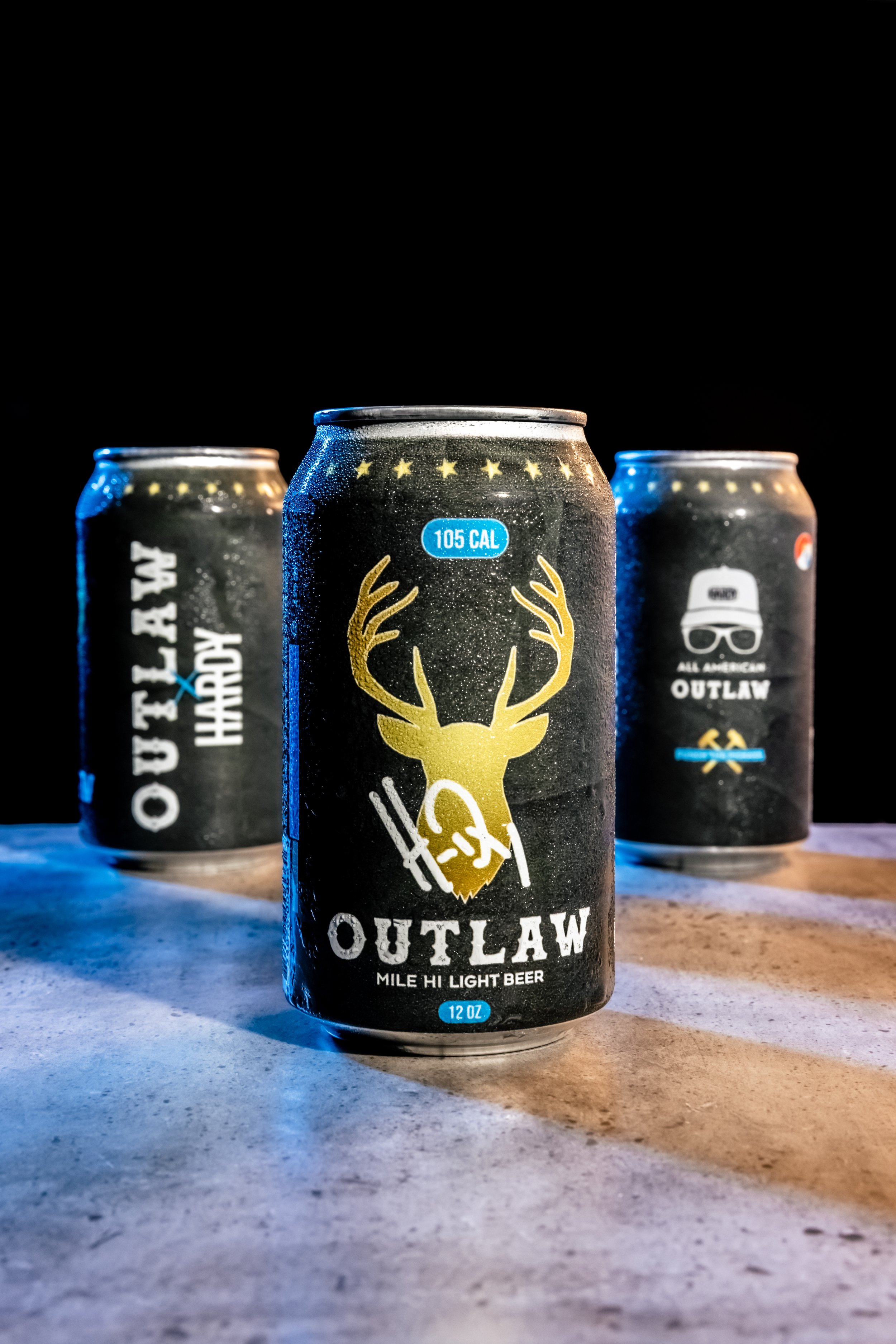
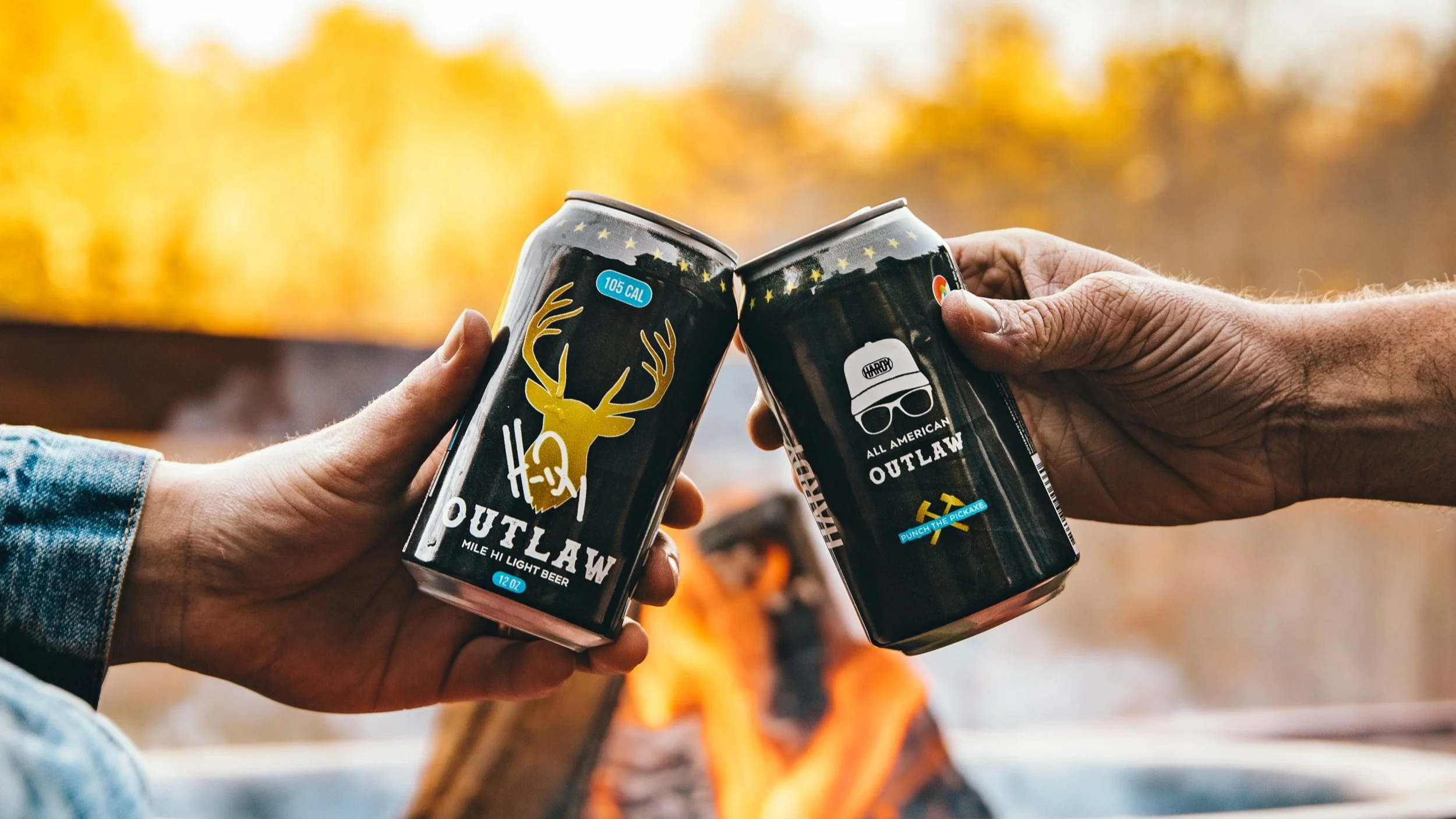
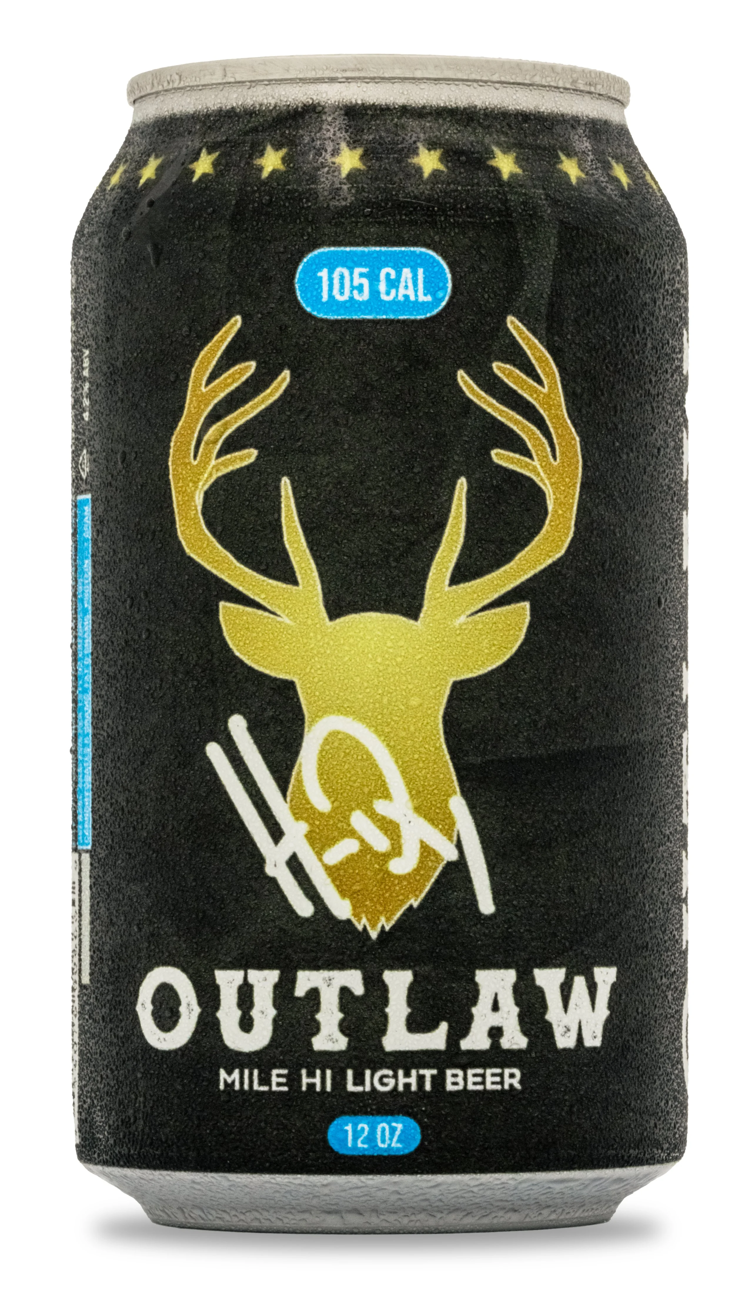
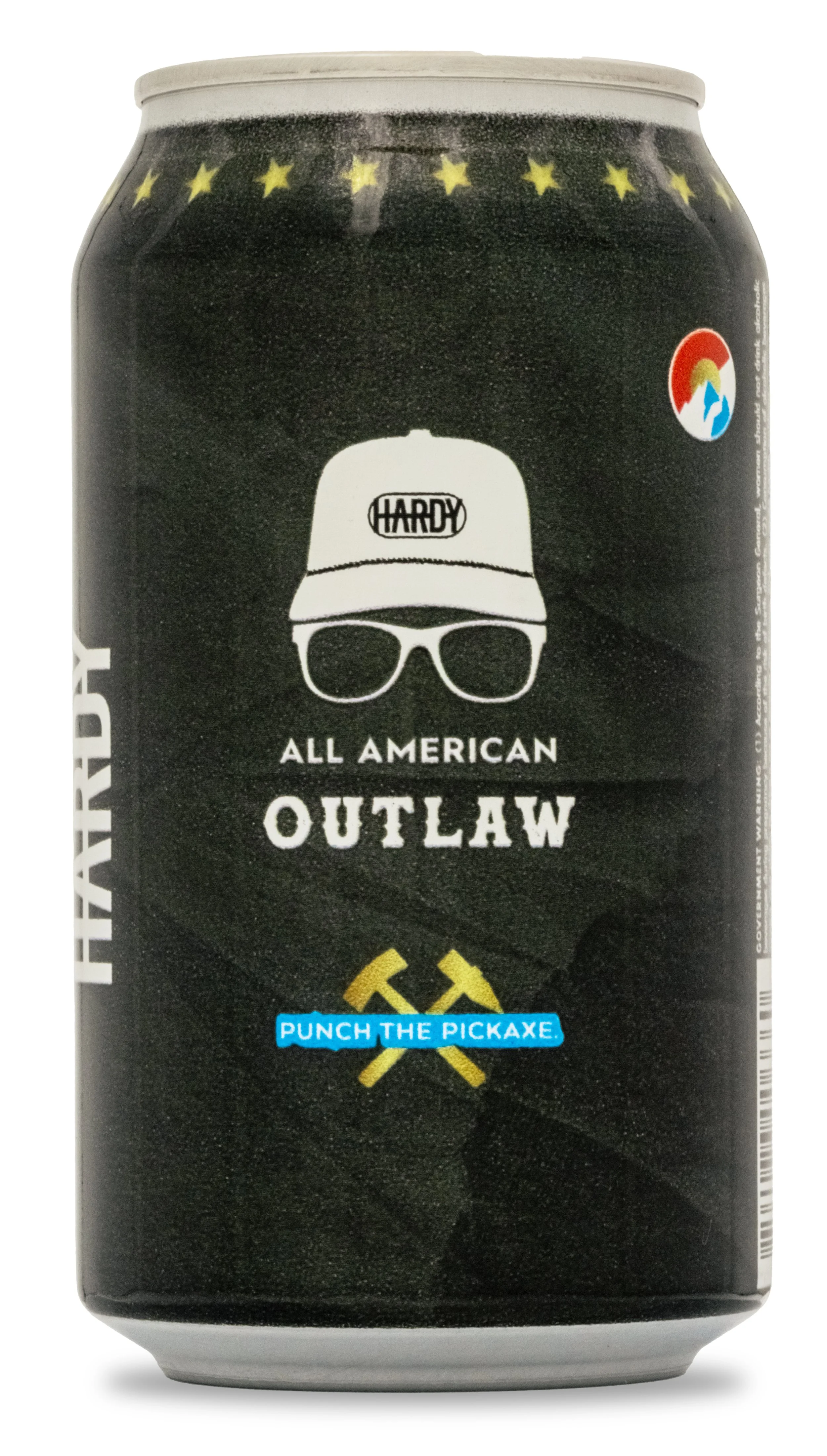
The branding for the collaboration was developed to reflect HARDY’s personal identity while staying aligned with the established Outlaw Beer system. A darker, more muted color palette was chosen to match his gritty, outdoors-driven aesthetic. Custom Mississippi pine elements were introduced as a subtle nod to his roots, and the signature Outlaw elk emblem was reinterpreted as a deer mark to better reflect his connection to hunting. Throughout the direction, the goal was to keep the visuals authentic to HARDY while still maintaining clear brand recognition for Outlaw Beer.
branding
PACKAGING
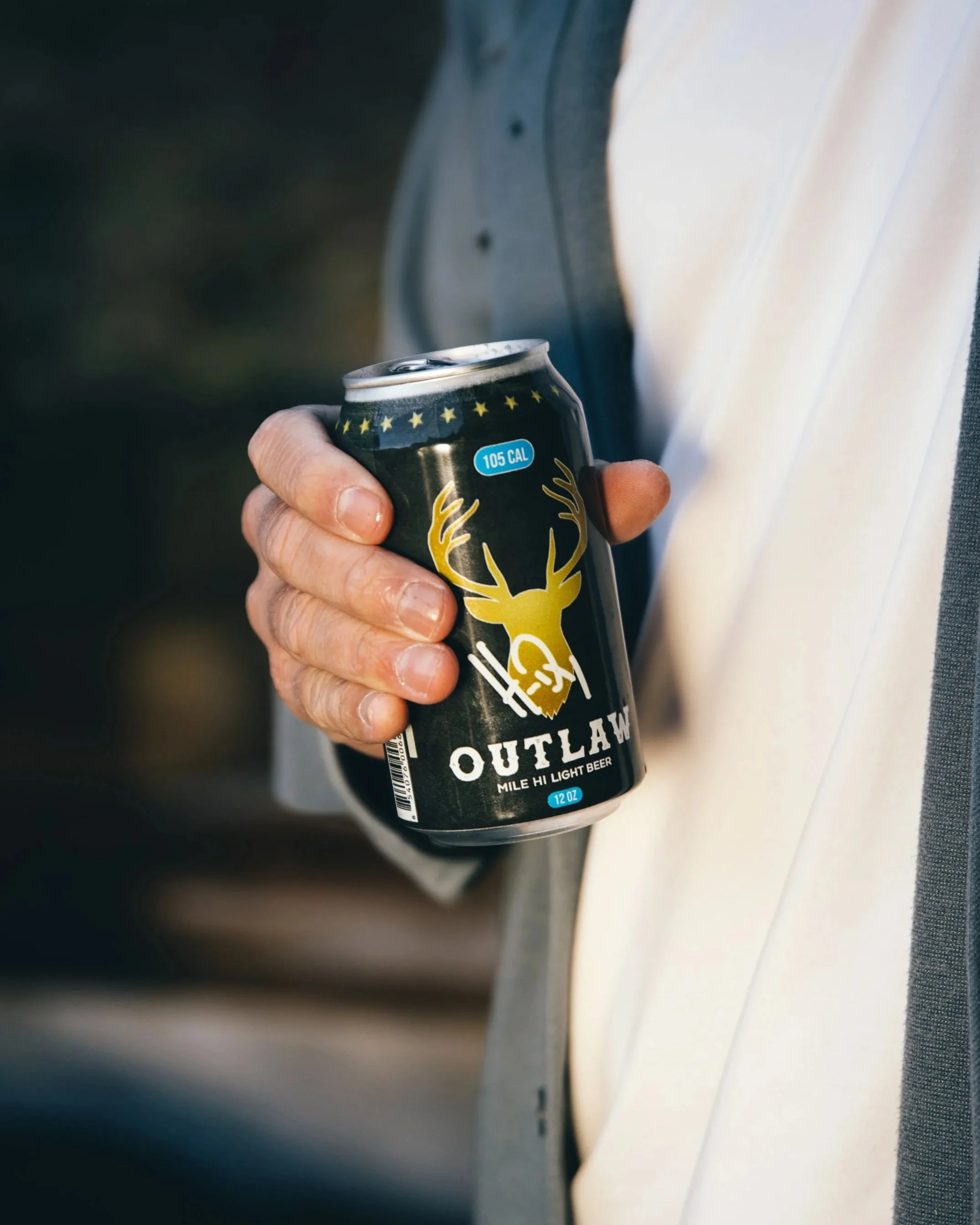
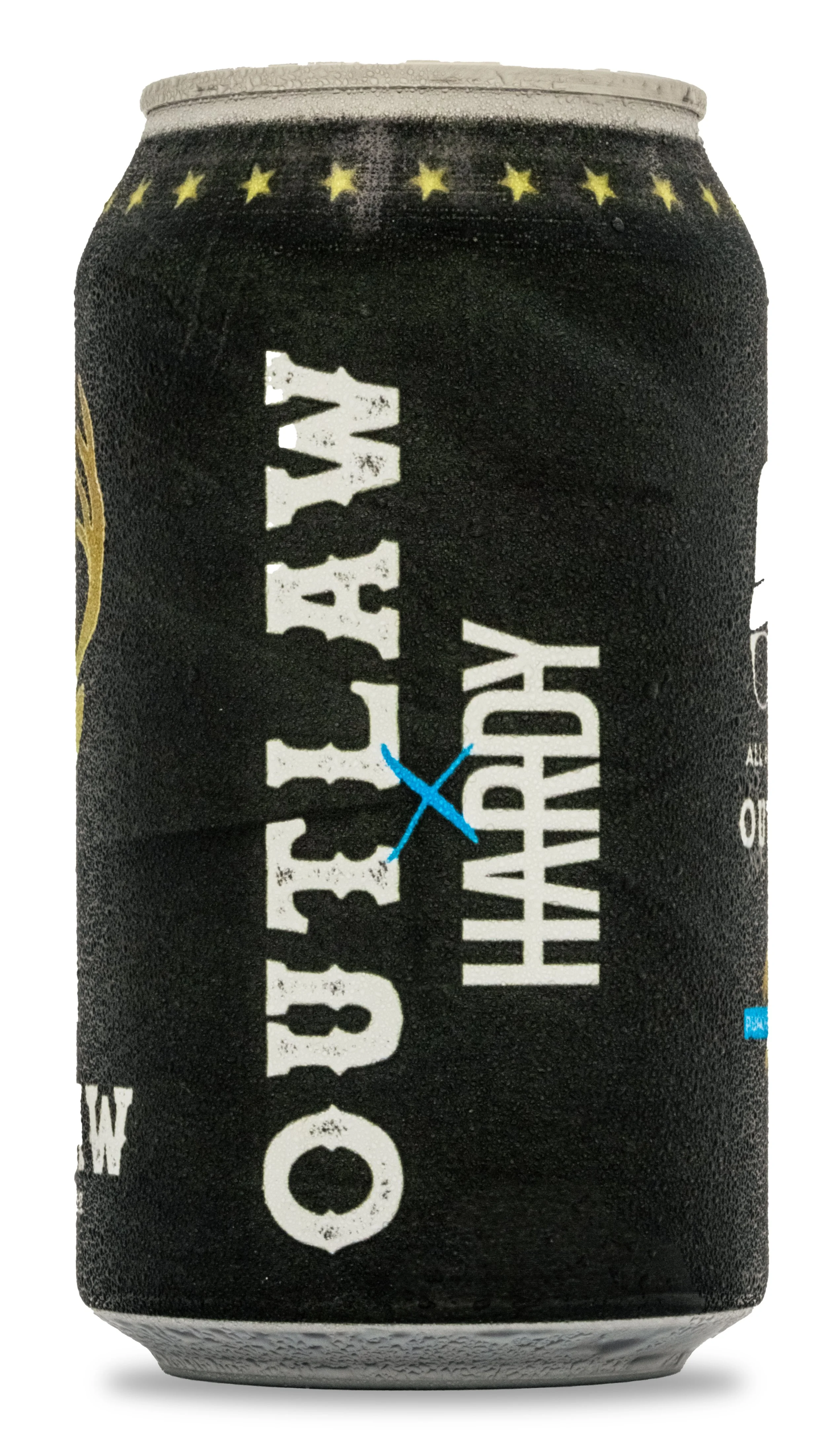
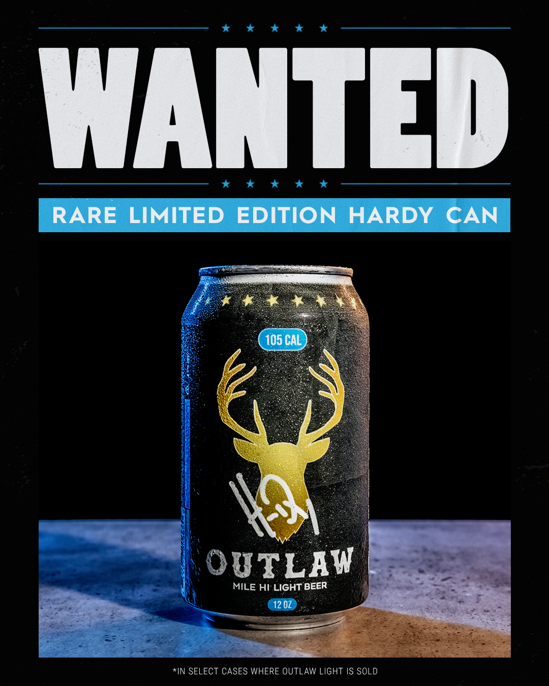
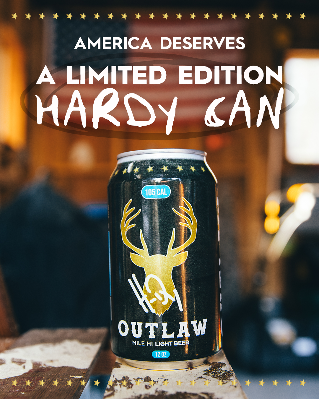
The final can and case system expanded these ideas into a fully realized product experience. The can carried the same darker palette and featured the reworked deer emblem as a central visual anchor, replacing the standard Outlaw elk while still feeling like a natural evolution of the brand. Mississippi pine illustrations were integrated into the supporting graphics to reinforce the personal storytelling tied to HARDY’s background.
For the case design, a camo blue pattern was developed as a direct creative request from HARDY, helping the product stand out while staying rooted in an outdoors aesthetic. The case echoed key elements from the can so the two worked as a unified set, with consistent typography, layout structure, and brand hierarchy. Even with the customizations, the system was carefully balanced to ensure the collaboration remained instantly recognizable as part of Outlaw Beer’s visual world while still feeling distinctly tied to HARDY’s identity.
can + CASE DESIGN
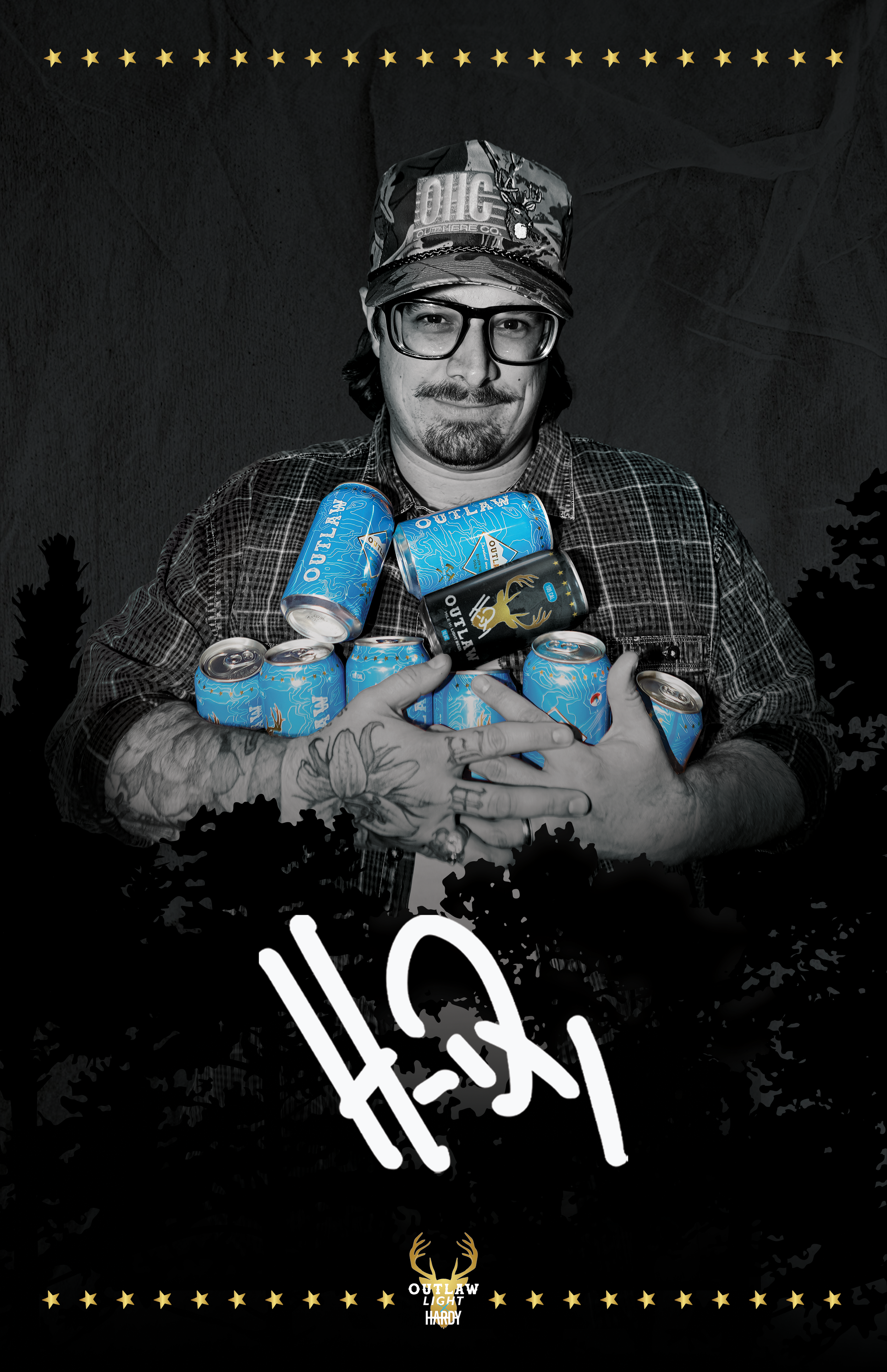
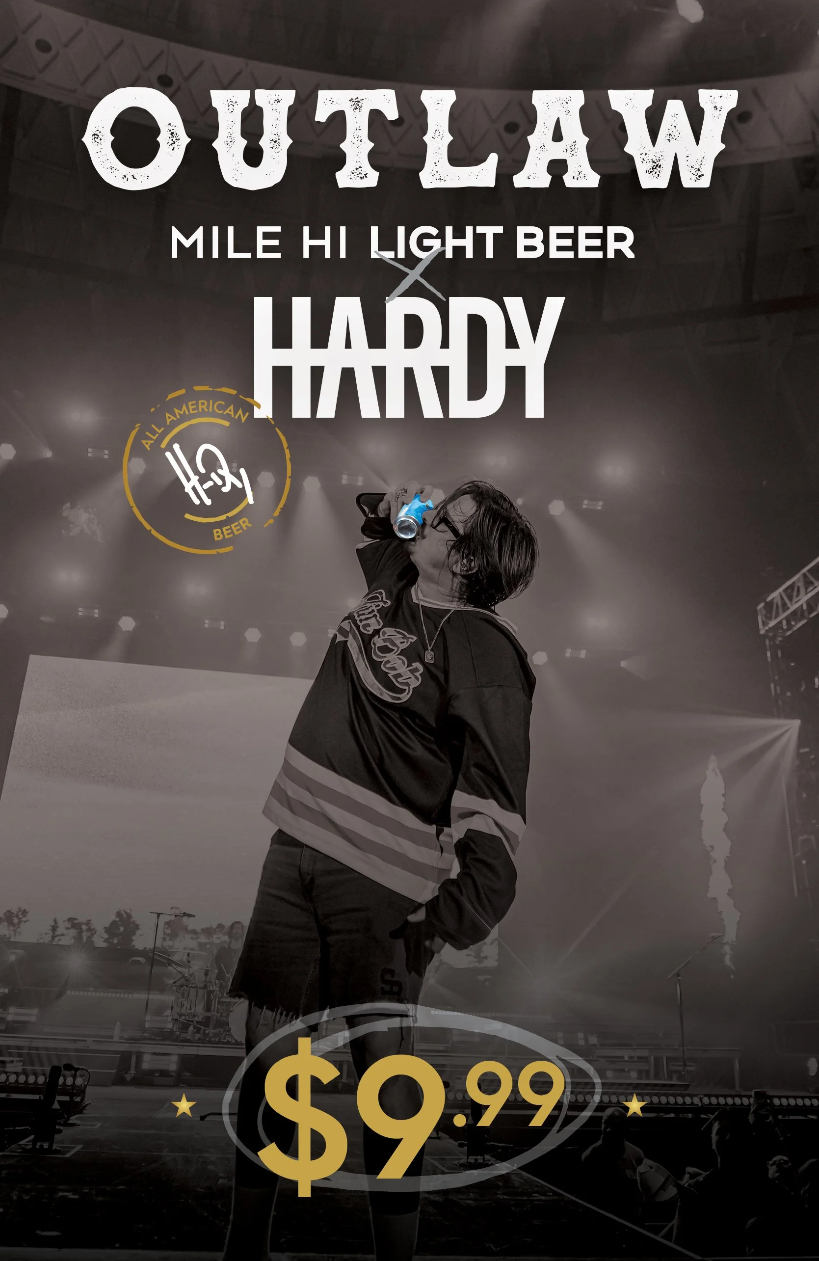
The campaign extended beyond packaging into a full rollout of signage and social content across multiple touchpoints. This included teaser and giveaway graphics designed to build anticipation ahead of launch, as well as coordinated social posts that introduced the collaboration and highlighted key design elements.
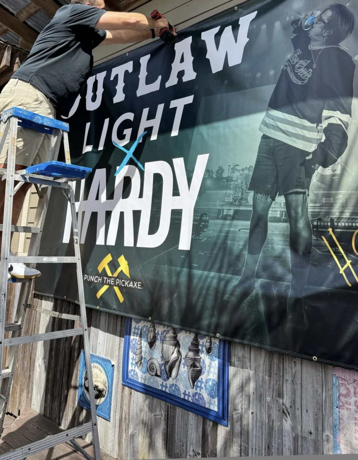
On the physical side, large-scale signage was developed for placement in bars and package stores nationwide, including oversized banners and promotional displays that reinforced the launch at the point of sale. These assets were designed to maintain visual consistency with the can and case system while scaling the campaign into real-world environments where consumers would directly engage with the product.
Signage + Social media
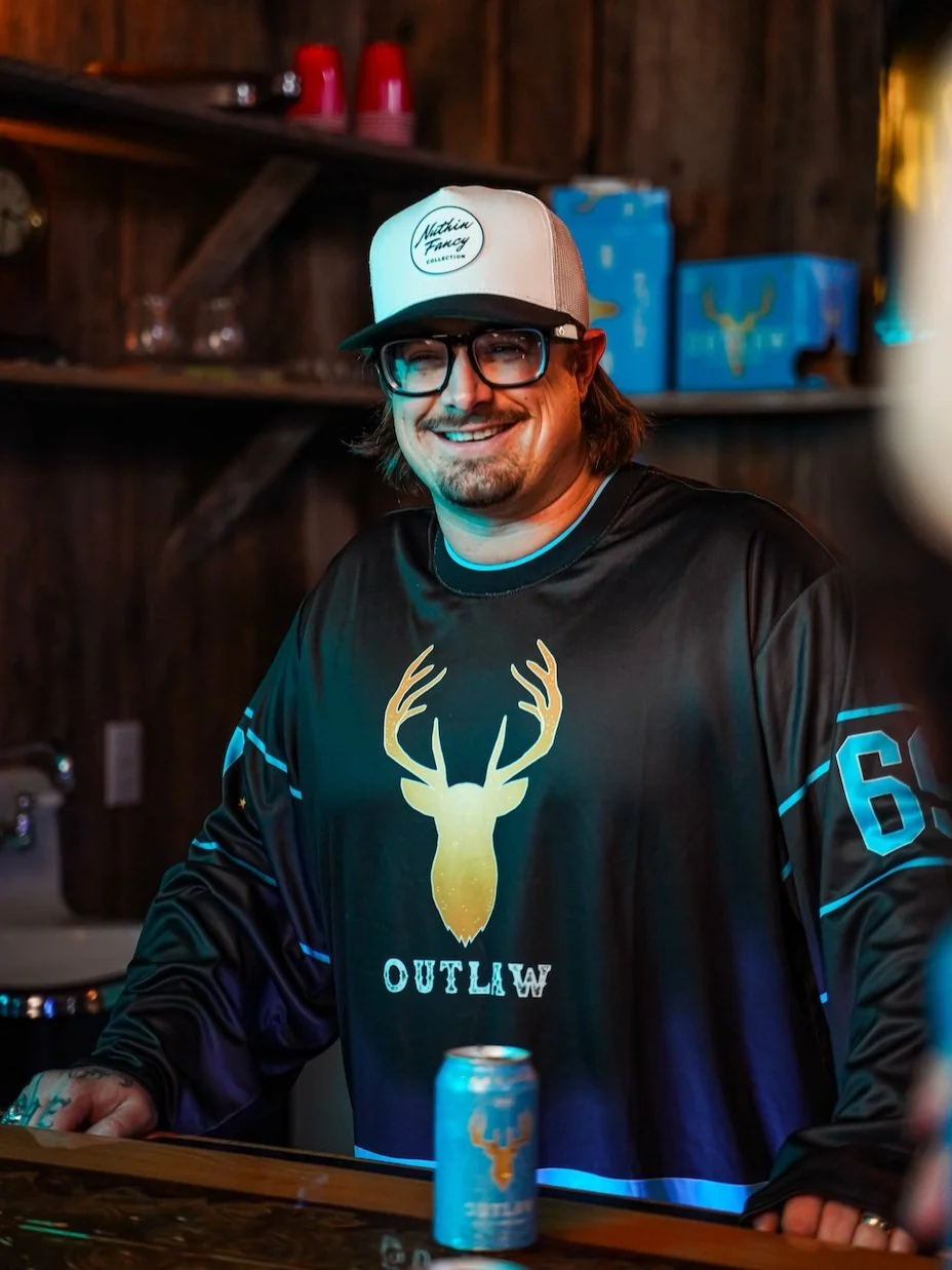
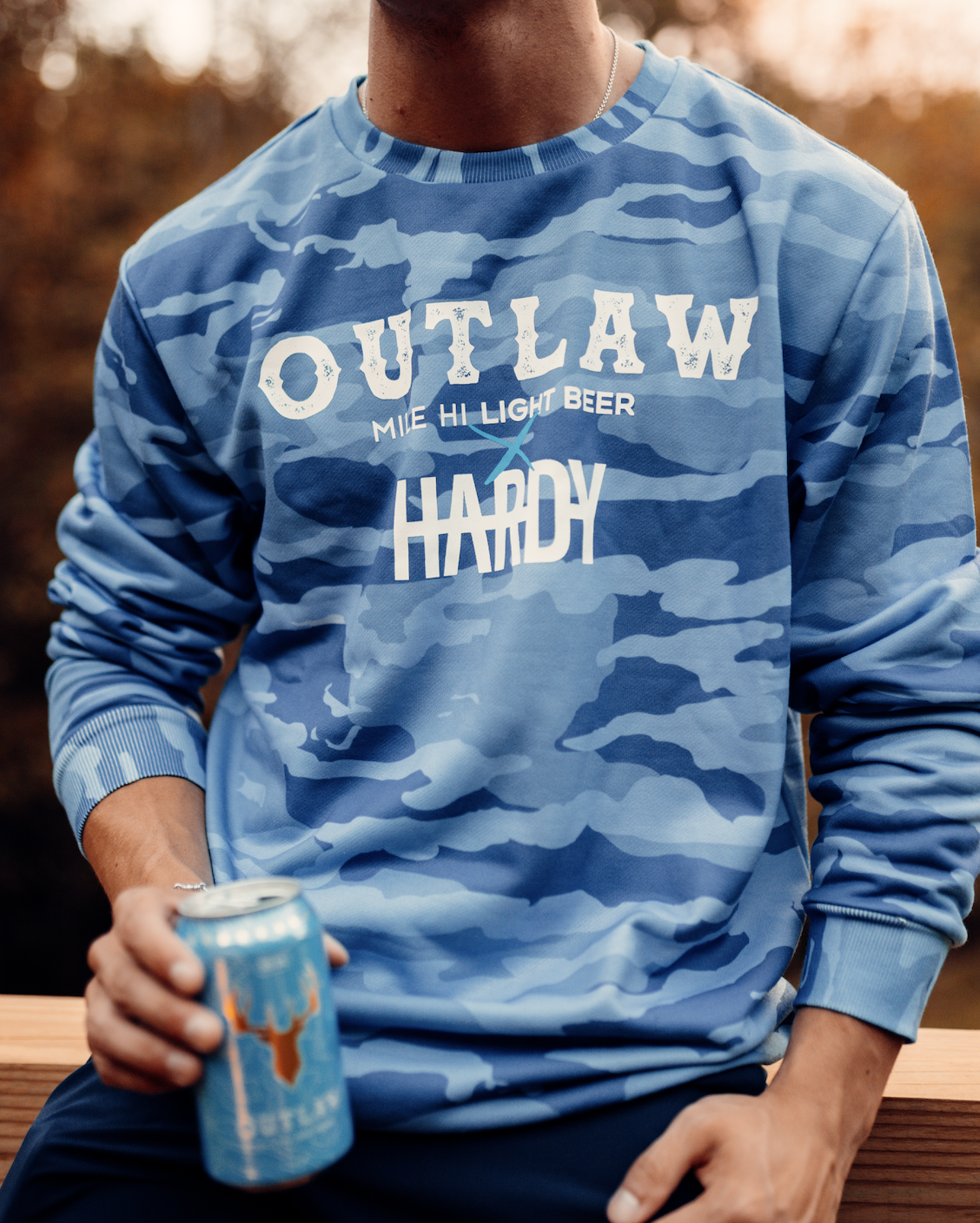
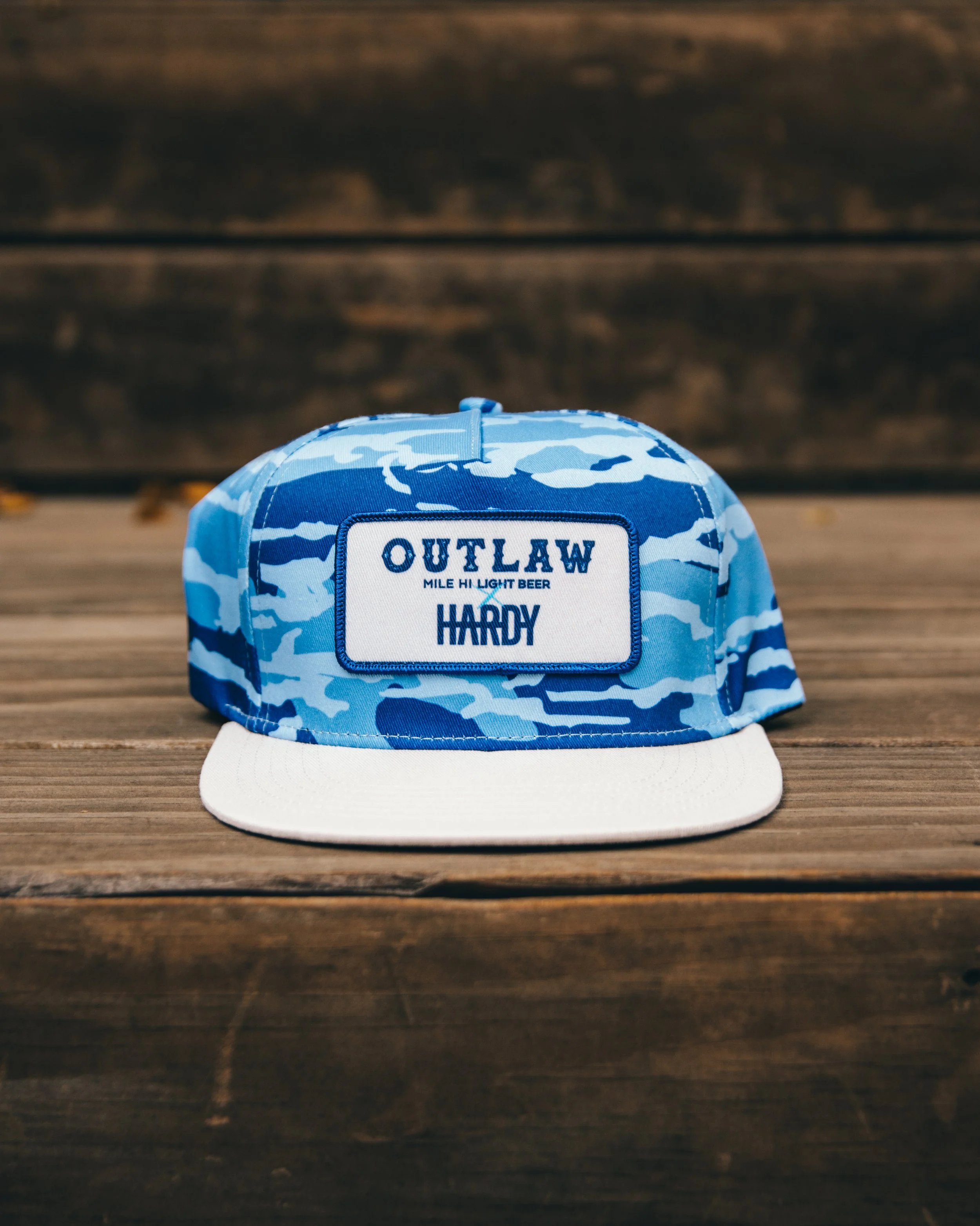
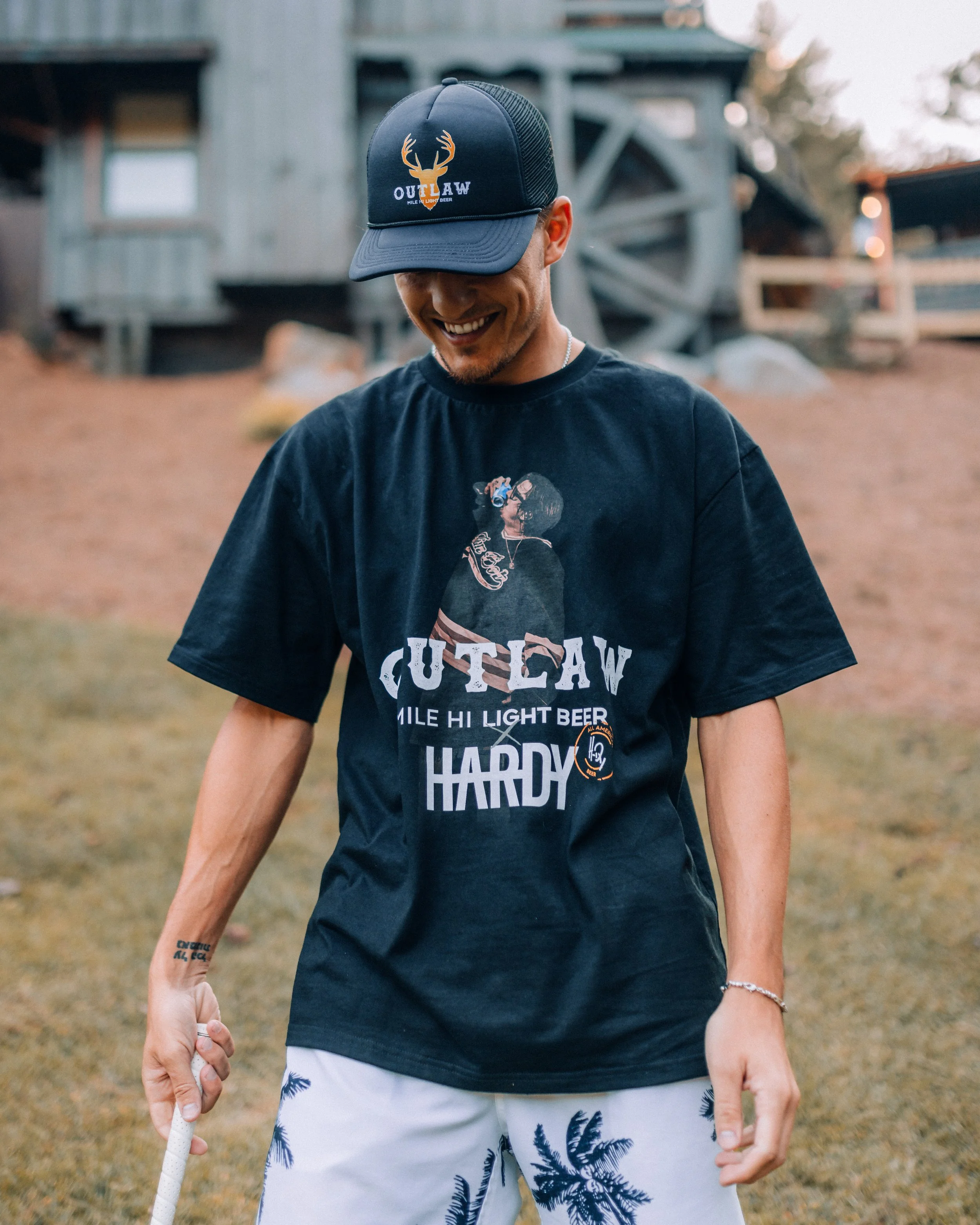
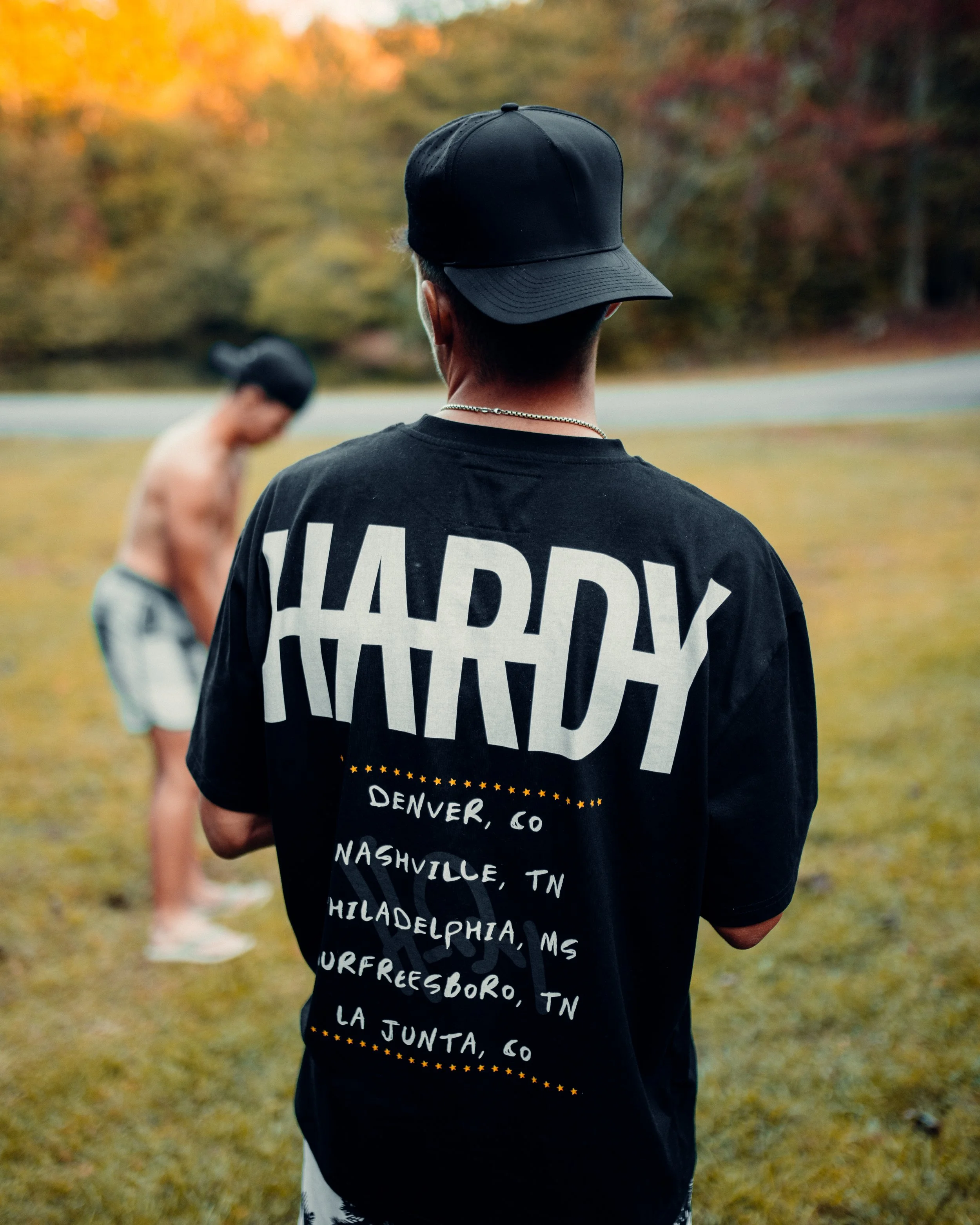
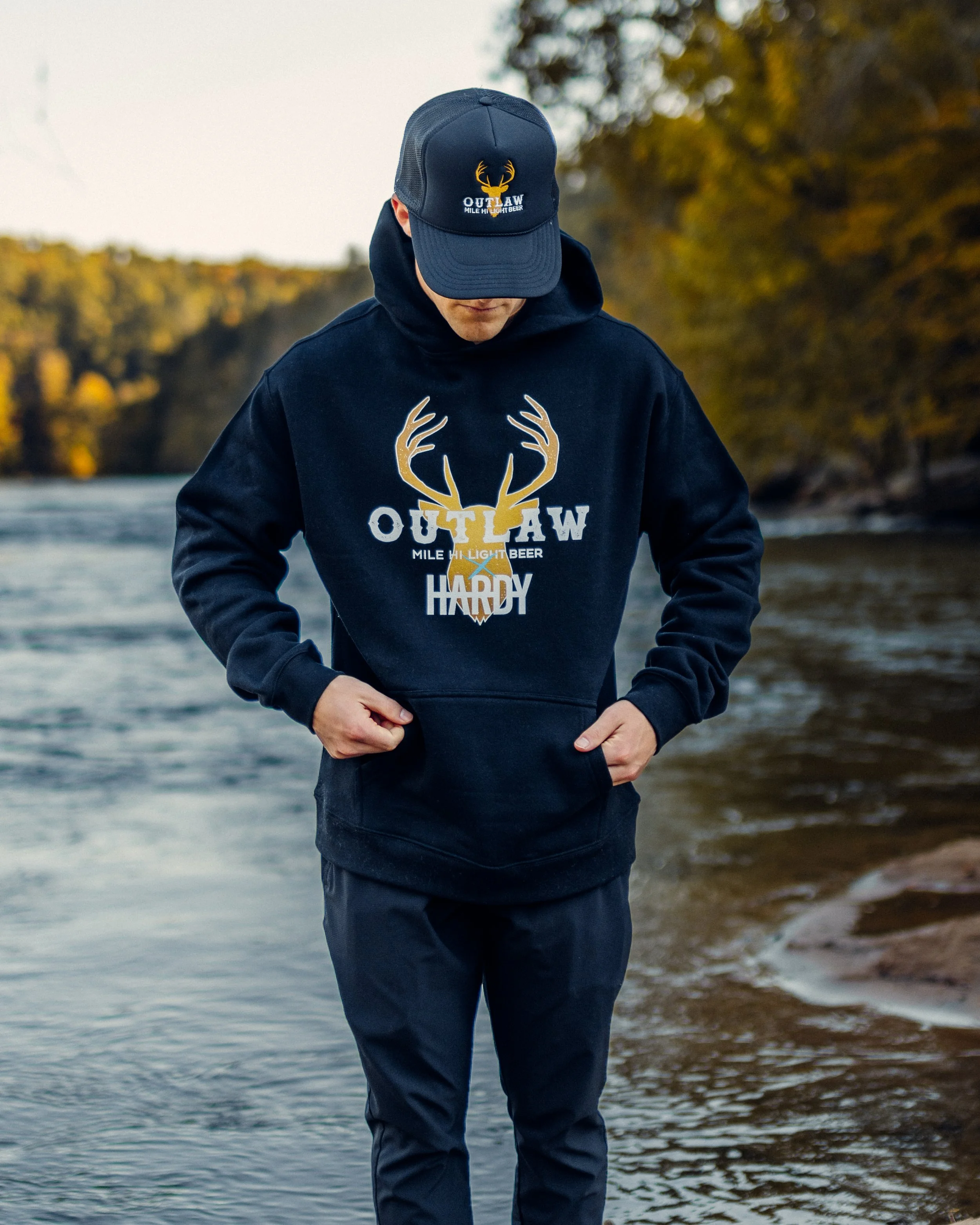
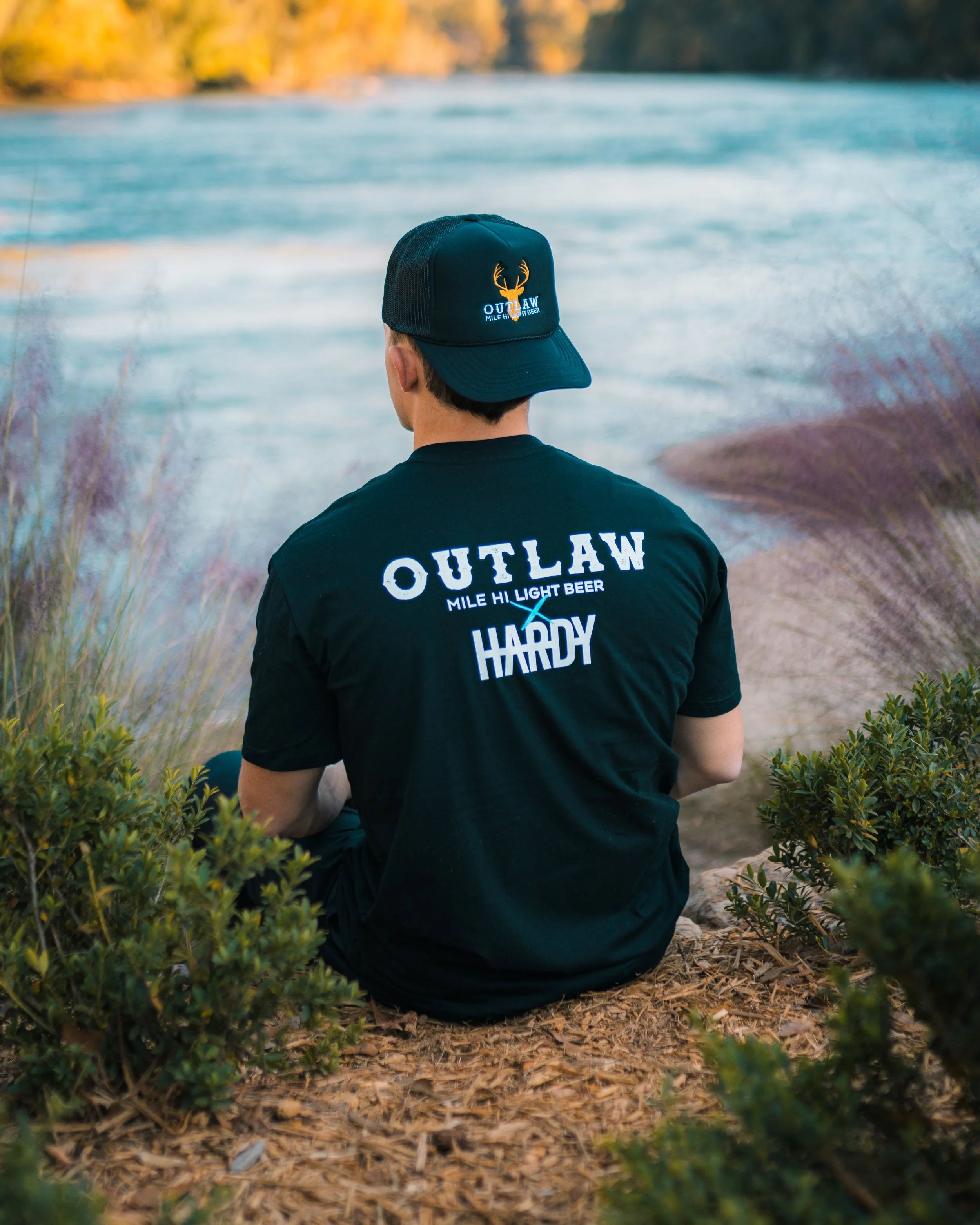
A supporting merch line was created to extend the collaboration beyond packaging and retail materials, giving fans a wearable connection to the campaign. The designs pulled directly from the core visual system, including the darker palette, Mississippi pine motifs, and the reimagined deer emblem, ensuring consistency with the can and case artwork.
Pieces were designed to feel like authentic tour-style merchandise rather than traditional promotional apparel, aligning with HARDY’s aesthetic while still reinforcing the Outlaw Beer brand. The result was a cohesive collection that translated the campaign identity into everyday items, helping deepen engagement with the collaboration beyond the product itself.
merch DESIGN